Accuracy Analysis#
In the Accuracy Analysis section of part D of your project’s documentation, you will need to define and discuss how the metric for measuring the success of your application’s algorithm.
As we are trying to predict a continuous number, even the very best model will have errors in almost every prediction (if not, it’s almost certainly overfitted). Whereas measuring the success of our classification model was a simple ratio, here we need a way to measure how much those predictions deviate from actual values. See sklearn’s list of metrics and scoring for regression. Which metric is best depends on the needs of your project. However, any accuracy metric appropriate to your model will be accepted.
To get some examples started, we’ll use the data (with type and model from the previous sections. Recall, the model predicts a number for sepal-length.
from sklearn.linear_model import LinearRegression

linear_reg_model = LinearRegression()
linear_reg_model.fit(X_train,y_train)
y_pred = linear_reg_model.predict(X_test)
Mean Squared Error#
The mean square error (MSE) measures the average of the squares of errors (difference between predicted and actual values).
Where \(Y_i\) and \(\bar{Y}_i\) are the \(i^{\text{th}}\) actual and predicted values respectively.
In addition to giving positive values, squaring in the MSE emphasizes larger differences. Which can be good or bad depending on your needs. If your data has many or very large outliers, consider removing outliers or using the mean absolute error. See the sklearn MSE docs for more info and examples.
Applying the MSE to the test data, we have:
from sklearn.metrics import mean_squared_error

mean_squared_error(y_test, y_pred)
0.12921261168601364
MSE explanation and example in 2D#
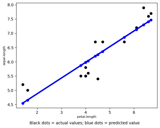
For illustration purposes, we’ll use just the petal-length to predict the sepal-length with linear regression on 15 random values. For a multi-variable case, see the [example below](sup_reg_ex: develop: accuracy: MSE_2).
The regression line looks like this:
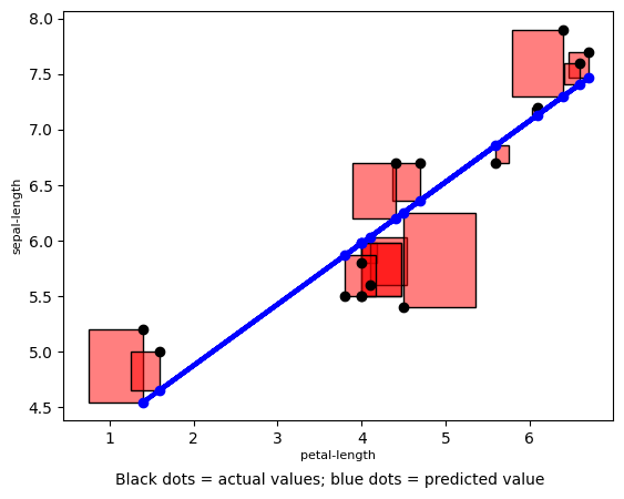
The error squared looks like:
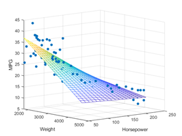
Increasing the number of variables uses the same concept only the regression line becomes multi-dimensional. For example, additionally, including ‘sepal-length’ and ‘petal-length’ creates a 4-dimensional line. So it’s a little hard to visualize. Using the squares of the errors is standard but ME is sometimes easier for non-technical audiences to understand.
MSE for Multivariable Regression#
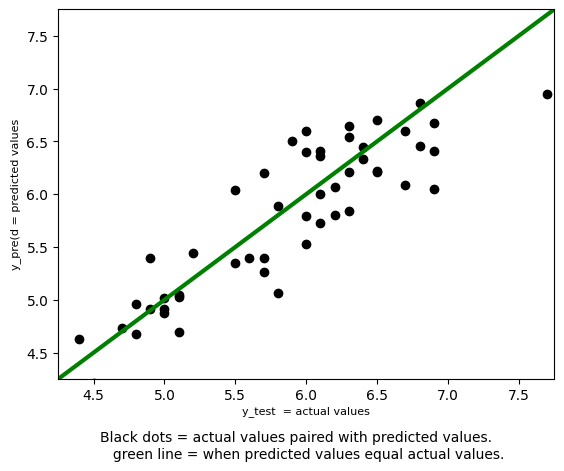
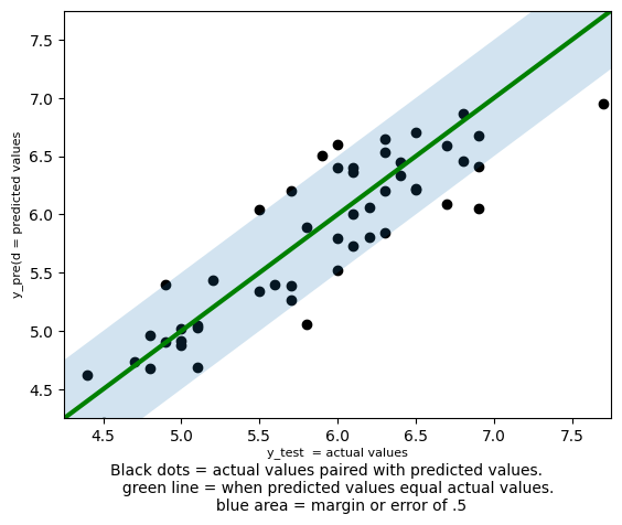
The case above presents Regression as most people are introduced to the concept -with two variables. Adding more variables does not change how MSE is computed, and the predicted values are still one-dimensional. However, visualizing the regression line can be interesting when there are more than two independent variables. One approach is to simply plot predicted and true values as paired data points. While some information about the model and relationship is lost, it does clearly show the model’s accuracy.
\(R^{2}\), \(r^{2}\), \(R\), and \(r\)#
Warning
These metrics are for linear models only! While they can be computed for any model, the results are not necessarily valid and can be misleading. For more details see \(R^{2}\) is Not Valid for Nonlinear Regression and this paper.
What’s a linear model? See Difference between a linear and nonlinear model and sklearn’s Linear Models
These metrics (as with linear regression) have long been used in statistics before being adopted by the ML field. While ML uses these tools with a focus on results, statistics is a science so uses them differently. The overlap is the cause of some confusion and inconsistencies in the ML jargon. Here we’ll quickly try to clarify some of that. If working on the data as a science, we recommend the scipy library.
\(r\): the (sample) correlation coefficient is a statistic metric measuring the strength and direction of a linear relationship between two variables, e.g., \(X\) and \(Y\); sometimes denoted \(R\). There are different types (usually Pearson when not specified) all having values in \([-1,1]\), with \(\pm 1\) indicating the strongest possible negative/positive relationship and \(0\) no relationship. Confusingly (maybe sloppily), sometimes \(r\) denotes the non-multiple correlation between \(Y\) and \(\hat{Y}\) (values fitted by the model), in which case \(r\geq 0\) (see the [image above](sup_reg_ex: develop: accuracy: MSE_example)).
\(R\): the coefficient of multiple correlation or correlation coefficient measuring the Pearson correlation between observed, \(Y\), and predicted values, \(\hat{Y}\). \(R=\sqrt{R^{2}}\) and \(R\geq 0\) (assuming the model has an intercept) with higher values indicating better predictability of a linear model (as shown in the [image above](sup_reg_ex: develop: accuracy: MSE_2)).
\(R^{2}\): the coefficient of determination measures the proportion of the variation in the dependent variable predictable (by the linear model) from the independent variable(s), i.e., a metric measuring goodness of fit. The most general definition is: \(R^{2}= 1 -\frac{SS_{\text{res}}}{SS_{\text{tot}}}\) where \(SS_{\text{res}}=\sum_{i}(y_i-\hat{y}_i)^2\) (the residual sum of squares) and \(SS_{\text{tot}}=\sum_{i}(y_i-\bar{y})^2\) (the total sum of squares). The former sums squared differences between actual and model output, and the latter sums squared differences between actual outputs and the mean. When \(SS_{\text{tot}}<SS_{\text{res}}\), i.e., the mean is a better predictor than the linear model, it’s possible for \(R^{2}\) to be negative.
\(r^{2}\): \(r^{2}\) is not necessarily \(R^{2}\). For simple linear regression, \(R^{2}=r^{2}\), but when the model lacks an intercept things get more complicated, and unfortunately there are some inconsistencies in the notation.
\(R^{2}\) and \(r\) have can be more intuitively understood compared to the mean squared error and similar metrics, e.g., MAE, MAPE, and RMSE which have arbitrary. \(r\) determines if variables are related, but since ML is more often concerned with how well a model predicts, \(R^{2}\) is more frequently used.
from sklearn.metrics import r2_score
# https://scikit-learn.org/stable/modules/generated/sklearn.metrics.r2_score.html#sklearn.metrics.r2_score

r2_score(y_test, y_pred)
0.76202887109925
\(76.2\%\). Is that good? Here, as with most ML models, our goal is predicting the dependent variable. To demonstrate how well our model fits to actual results (it’s goodness of fit), the closer to \(1\) the better. But what’s close enough? That depends on how precise you need to be. Some fields demand a standard as high as \(95\%\). However, as a percentage of the dependent variable variation explained by the independent variables, 0.76202 is a big chunk. Here’s a rough, totally unofficial guideline:
\(R^{2}\) |
Interpetaion |
|---|---|
\(\geq 0.75\) |
Significant variance explained! |
\((0.75, .5]\) |
Good amount explained. |
\((0.5, .25]\) |
Meh, some explained. |
\((0.25, 0)\) |
It’s still better than nothing! |
\(\leq 0\) |
You’d be better off using the mean. |
Conveniently, I’ve defined my model’s performance as a great success 😃. But in reality this very subjective and depends on the situation, field, and data. See this discussion, is there any rule of thumb for classifying \(R^2\). Modeling complex and interesting situations will naturally be more difficult and should be held to different standard. In the behavioral sciences, the following guidelines for measuring the effect size are popular (as found [Cohen, 2013]):
\(R^{2}\) |
Effect |
|---|---|
\(\geq 0.26\) |
Large |
\(0.13\) |
Medium |
\(0.02\) |
Small |
As any \(R^{2} > 0\) provides a predictive value better than the mean, any positive \(R^{2}\) can be argued to have value.
Margin of Error#
The best way to measure your model’s success depends on what you’re trying to do. Say my flower customers want to predict sepal-length (I have no idea why), but any prediction within 0.5 of an inch would be acceptable. That is a “good” prediction, would be any falling with the dashed lines:
def percent_within_moe(actual, predict, margin):
    total_correct = 0
    predict = predict.flatten()
    actual = actual['sepal-length'].tolist()
    for y_actual, y_predict in zip(actual,predict):
        if abs(y_actual - y_predict) < margin:
            total_correct = total_correct+1
    percent_correct = total_correct/len(actual)
    return percent_correct

percent_within_moe(y_test, y_pred, .5)
0.84
So \(84\%\) of predicted test values were within \(\pm .5\) of being correct. In addition to being easy to interpret, this approach can be modified to meet the specific needs of your project. A stock exchange prediction model, for example, predicting within a range or not overpredicting (i.e. predicting a profit when a loss occurs) might matter more than the MSE. It also has the added flexibility of being able to define success.
percent_within_moe(y_test, y_pred, 1.5)
1.0